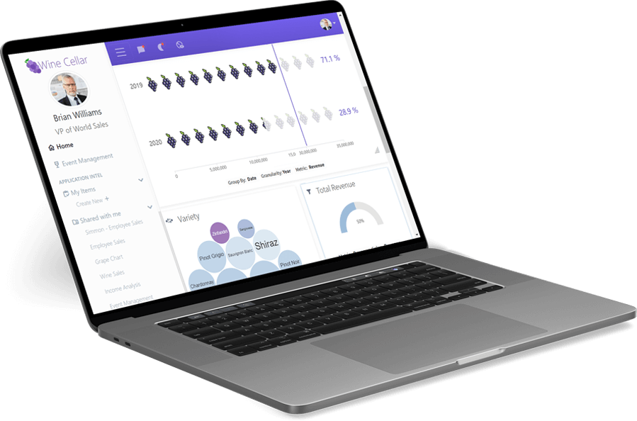
Go Beyond Colors and Styles With Unmatched Customization
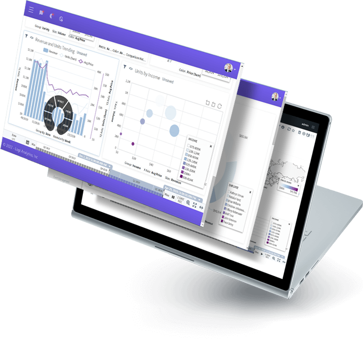
Allow users to control every aspect of their visualizations so they see their data in a way that resonates.
Your dashboards are full of rigid charts and graphs that don’t draw the user’s attention to the analytics.
The data visualizations are not embedded within the application requiring extra work outside the user’s workflow to access them.
Making changes to existing visualizations requires developer time, leading to a backlog of requests for the busy dev team.
Allow users to control every aspect of their visualizations so they see their data in a way that resonates.
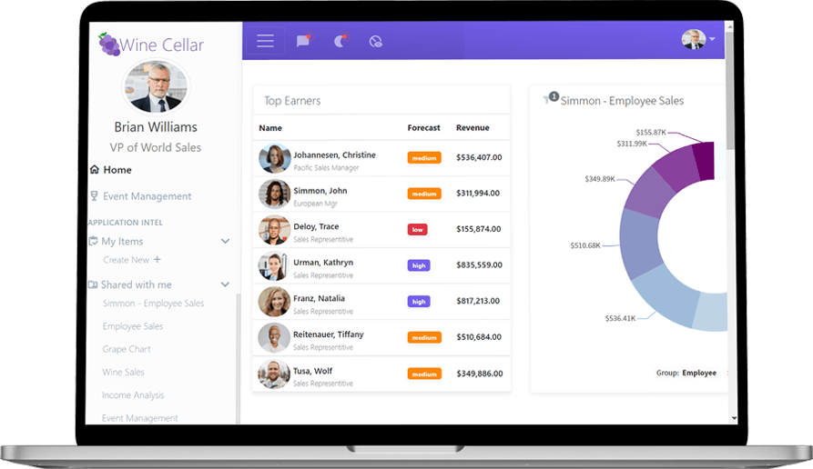
Match the look and feel of your application with white-labeled analytics that are designed to keep your user in your application.
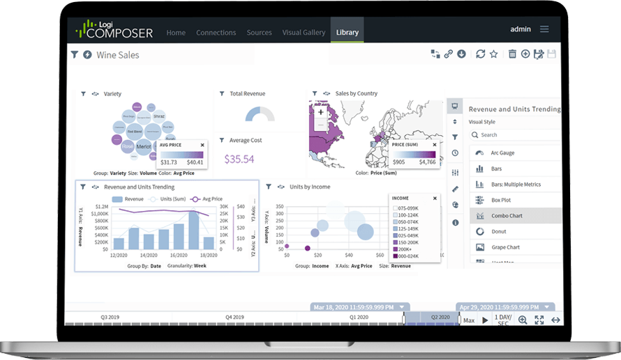
Low-code design and personalized self-service empowers your users to create their own visualizations, saving your developers from getting involved.


The world of data analytics is changing fast as organizations look to gain competitive advantages through the application of timely data.
As the analytics landscape has evolved, application teams who need to embed dashboards, reports, and other analytics capabilities in their commercial and corporate applications can choose from dozens of solutions. How do you differentiate one solution from the next?
Choosing the best solution for your dashboards and reports starts with understanding the types of analytics solutions on the market.
You’ll learn:
The difference is night and day. You couldn't pay me to go back before Logi Symphony.